DaVinci Horse Print Sale

I am running a little more than half price off sale at:

http://catherine-twomey.artistwebsites.com/

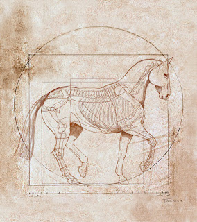
on the "Da Vinci Piaffe" horse print, for a dear horse friend, until August 30, 2012. If you'd like an unprecedented "deal", this is it.

Look under the "Horses" link to the right. There are available a variety of sizes of prints framed on canvas, simple single sheet prints, even greeting cards.

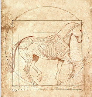
Anatomically Accurate Horse a la Leonardo da Vinci Sale Twomey


Background:


Description:
Commissioned for the cover of the "United States Dressage Federation" magazine Connections, it was inspired by "The Vitruvian Man" by Leaonardo da Vinci circa 1487. This could be considered the "Canon of Proportions" for the horse performing the dressage movement piaffe. It is based on the correlations of ideal horse proportions with geometry. It exemplifies the blend of art and science during the Renaissance. 

Winning painting/illustration of the American Horse Publications Annual Awards, First Place in Illustration for "Da Vinci Horse", 2007. This print shows an anatomically accurate transparent horse and skeleton

Charitable Works for African Children


Image of child's normal eyes, South Africa, Twomey
Illustration of Normal Eyes of an African Child for Ocular/Eye Examination

J
ust starting a charitable project that will help nurses in South Africa detect eye/ocular pathologies in children. Hope to visit Africa next spring and see the illustrations & copy in action. Here are normal eyes.

Marketing: Emerging Artist Tips 8.0


Continuing to respond to the series of questions I recently received from a new art school grad who needs marketing help, this Q and A or FAQ touches on a common stereotype for artists: being reclusive, quiet, socially inept, weird, anxious, reticent - you get the idea.

Q:
Part 2 of the original question: I'll go right out and say it -- I feel as if my networking skills are completely awful. I'm very shy and I feel uncomfortable approaching people, especially in business situations. I'm at a dramatic disadvantage here. I need to work on this. Overcoming these fears is the area where I feel I could use the most help, I think.

A:
When I started I was very shy; in both business and social situations I was as quiet as a mouse and rarely spoke up let alone be assertive about my skills. No one knew how I was suffering, mainly because I was so quiet and shy that I never could talk about it!!

However, there was a spark inside me that pushed me, over time, to learn about and get over that fear. It took effort, practice and motivation to do this. It still pops up now and again, mainly because it's hard wired into my particular artistic temperament. However, it is VERY treatable and very common. Many people experience anxiety, but only about a third of those who do actually do anything about it.

Today, my clients, friends and family would laugh if I told them I was shy and retiring. I find that a wonderful compliment!

Right now I'm reading:

The Mindful Way through Anxiety: Break Free from Chronic Worry and Reclaim Your Life by Lizabeth Roemer andSusan M. Orsillo (Jan 18, 2011)

which yet again gives me the confidence and strength to have a great life. There are a lot of "spiritual" and "touch-feely" types of books out there, but that's not me. I'm practical and want to know how to guide myself through life.

Some more business tips:

Tad Crawford is considered a strong, artist-oriented leader for the business side of the arts. Here's a link to amazon.com where you can find all sorts of his books. Back in my day, he only had this one book:

which was invaluable. It's probably dated now, but it looks like he has many other newer guides that are specific to various industries:

http://www.amazon.com/s/ref=nb_sb_noss_1?url=search-alias%3Dstripbooks&field-keywords=tad+crawford


Another older but well-referenced book that taught me more than I'll ever appreciate:

2012 Artist's & Graphic Designer's Market [Paperback]

Mary Burzlaff Bostic

The publishers also now have a website: 


I used to buy these books every year, read the relevant parts for my field, and then make the cold calls. A huge help that motivated me as well as led me to a lot of contacts and work.

One more piece of experience:

When you make cold calls and you finally get a human, they may attempt to just push you away. If you can tell that's what's going to happen, ask them if they're not buying at the time, could they (please) recommend someone who might be? They just might give you the name of someone else in their company/ad agency, or someone outside their business that will open up a whole new set of doors. Try to get something out of every call.

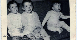
Cathy, Steve and Ann
My artistic influences growing up. That's me on the left, Steve then Ann. Take careful note of the pajamas with feet; must have lost mine that day. We were trouble, with a capital "T". In the living room at our house in Naperville, Illinois. Probably planning an evil deed.

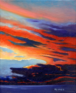
"Ocean Storm Sunset" Original Oil Available at Auction


Click Here to Bid


Oil on linen on stretched canvas, 8 X 10", 2011. Carefully packaged; signed by the artist.

About the Painting:  Ocean Storm Sunset was painted near Tampa, Florida in the spring. It is a plein air painting, which means it was painted outside on site, all at one sitting. This painting is full of vivid but accurate color, and the textured strokes add to the beauty and excitement of the coming storm. A layer of varnish has been applied, and archival materials were used throughout. 

Note: the second photo shows how the painting would looked framed. If you are interested in a frame, please add an additional $25.00 for a high quality frame and ready to hang piece. 

The Artist

Twomey's interests have evolved from consolidating and translating the most complex, stimulating visuals into personal artistic jewels. Nature and animals are her stimuli. Her images are founded in a love for the flow of the earth; a desire to convey the direct simplicity of the land as well as living, breathing things. Colors complement the seasons and are melded to reverberate off of each other. 

Complexity is explored as a jumping off point for the ultimate in simplicity. Twomey's goals are to create works that are “jewels” full of color, light, design and emotion. Her work can be influenced by the abstract work of Georgia O'Keeffe, or the realism of Winslow Homer, or the Impressionists, or even Pablo Picasso. 

AWARDS AND RECOGNITION 
• TED Conference: invitation to and work shown, the medical division, TEDMED (Technology, Information & Design) 
• Winner of the 2010 ArtInPlace Mural Competition Charlottesville, Virginia; Barracks Road, Charlottesville, 12 X 24' on Aluminum 
• Fellow of the Association of Medical Illustrators (FAMI), 2009 
• Exhibition at the William H. Benton Art Museum, Connecticut 
• Winner of the American Horse Publications Annual Awards, First Place in Illustration for 'Da Vinci Horse' 
• Exclusive medical illustrator for Roche Pharmaceuticals interactive multimedia program, OTIS: Organ Transplant Information Systems –Award-winning program distributed worldwide for heart, lungs, liver and additional transplant patient education 
• Accepted into League of Milwaukee Artists, 2005, juried 
• Founding Member, Illustrators Partnership of America, (Top 100 Illustrators nationally) 
• Salon judge and presenter, 2007 Association of Medical Illustrators Meeting, Bozeman, Montana 
• 17th Annual International Exhibition of Animals in Art - University of Louisiana Veterinary School, entry juried in - only 85 accepted out of 900 applicants 
• American Horse Show Association 'Buy' review of The Guide to Equine Electrolytes: What Every Owner and Trainer Should Know
• International Museum of Surgical Science, juried invitational show 
• Association of Medical Illustrators, Award of Excellence; Concepts in Biology 
• The RX Club/Art Directors Club, NYC, Best of Medical Art, Award of Excellence 
• Association of Medical Illustrators, Award of Excellence; Human Anatomy 
• Association of Medical Illustrators, Award of Excellence; Biology: Visualizing Life 
• The RX Club/Art Directors Club of New York City; Award of Excellence 
• Association of Medical Illustrators, Award of Excellence; Human Anatomy and Physiology 

Twomey is a graduate of the University of Illinois School of Biocommunication Arts and Northern Illinois University. She has also studied at Northwestern and Oxford. Catherine has practiced as a Board Certified Medical Illustrator for 25 years, and is currently working with the international eye-care organization, ORBIS, to produce a series of ocular illustrations that will educate nurses about children's eye pathologies in South Africa. 

PayPal is accepted for payment.
Marketing: Emerging Artist Tips 6.0

Introduction

Recently a young, fresh out of school artist/illustrator in New York City contacted me for advice about how to jump start his career. This is an on-going dialog about how to approach marketing your skills.

Random things can make or break your ability to get an assignment. It helps to prepare and control as much as you can. There are exceptions to every rule, of course, but your personal image and marketing methods are often your first, and maybe only, chance to make an impression.

Q:

I'm getting so discouraged about the number of "not interested" responses I get to my attempts to get work. Do you have some more creative ideas for getting clients? I don't care if it takes some work, I just want something to come out of it.

A:

Realize that you will make many, many calls and contacts for every one job you get. It helps to hear this, and this is a hard thing to do, but do not take it personally if you don't hear back. As best you can, keep negative thoughts and emotions out of it. This is just business. You don't need 100 clients until you're ready to handle 100 clients. If you can establish a few well-paying, dependable gems, you're on your way. 

  • Keep an eye out for online or print announcements (press releases) about people who are getting job promotions who might need your services in their new position. As in the previous marketing post, congratulate them, and start to imprint your images into their brains.
  • Use corporations, publishers, ad and design agency's websites to increase your ever-growing and ever-changing (Potential) Contact List. For example, take this ad agency with offices in New York: http://www.wk.com/ . On their website, go to: http://www.wk.com/people . There's a page full of creative/media people, from their offices in New York to all over the world, some already using illustration on this page, that you can start contacting. Note: these people change jobs ALL THE TIME! They leave for greener pastures, get promoted, get fired, etc. so it's worth it to keep up with them and their changing contact information, otherwise you could be lost in the shuffle.
  • Some of this best advice I ever got: develop a VERY THICK SKIN!


The Lloyd Library and Museum Collection

For the Lloyd Library and Museum Collection

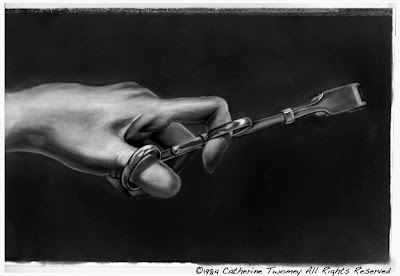
I date this original carbon dust medical illustration back to 1984. I call this the era of BC, as in Before Computers. That was my left hand in a surgical glove, attempting to hold the surgical retractor steady while trying not to sneeze and destroy everything at once. This was created using dust!! Computers were just on the horizon, and the use of this method of illustration was waning.


As student medical illustrators, we learned all of the illustration techniques of the old masters. I think the only time I used this technique was as a student. The method consisted of applying carbon dust, obtained by rubbing carbon pencils against an abrasive surface such as a metal file, to a prepared surface via dry brushes. Highlights were painted on or scratched out later in the process using fine instruments or erasures. A very specialized paper was used. Wonder if it's even made anymore.


This extremely fragile piece is entering the Lloyd Library and Museum in Ohio as a part of the Vesalius Trust Collection of Art Serving Medicine and Science. I hope to continue to post pieces as they're prepared for shipping.

Marketing: Emerging Artist Tips 3.0

Introduction

Recently a young, fresh out of school artist (working at Starbucks) in New York City contacted me for advice about how to jump start his career. He'd had some good assignments as an illustrator, but things have slowed greatly recently and he needs help.

His question below stems from my asking him if he is thinking of changing careers at this slow juncture, and finding a more lucrative "regular" job. A lot of succeeding as an artist is having an extraordinarily thick skin, stamina, and patience. It is not for the faint of heart or those vaguely motivated. 

Q:

I am not at this time considering changing careers. Yes, I am young. Yes, I am poor. If either of those sentences changes, then I'll revisit the subject. Until then, I hold firm to something my mother told me years ago, when I first expressed interest in commercial art -- that illustration is the business of the last man standing. If I can just hold on long enough, it will work. I will outlast the others because whenever I pick up a pencil or a paintbrush, I know that this is what I was meant to do. Whenever things get a little dry (right now would be a good example) I always toss options around out loud. I never really mean any of them. I'm here to stay.

A:

Being young and unencumbered (forgive me, I don't know if you're married and/or have children, I'm just guessing you're not) is the best way to start building a career in illustration. Your mother is exactly right - it takes almost unlimited perseverance at first. There will be weeks and months (and of course, weekends) when you have so much work you won't have a minute off and yet you can't afford to turn anything down; and then a dry period will test your commitment and make you get back to marketing all over again. 

The harder you work, the better you'll think, the freer you'll create, the more confident you'll become, and the more likely buyers will trust that you will do a terrific, professional job on time and on budget. They will trust you to make them look great.

You sound very self-aware of how you feel about being an illustrator. That's essential, because if you can't convince yourself that what you're doing is worth it, you won't convince anyone else.


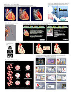
Cardiovascular samples to win interactive multimedia work.
The National Institute of Health contacted me years ago, wanting samples of my interactive multimedia cardiovascular work. I quickly put together this sample containing simple contact information and captions describing each project. This mailing was sent with a cover letter and resume; if I recall correctly, at the time it was quite risky if not impossible to send such large files online. Note that each sample shown is specifically geared to the heart and cardiovascular system. I got the job.


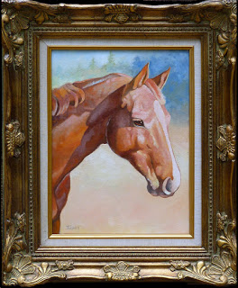
Wickers The Warmblood Finished & Framed

Framed, varnished and ready to deliver.light washes and color

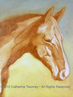
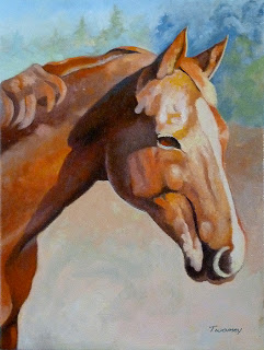
Finally finished up the portrait of the lovely Wickers the Warmblood. Wicker's owner is very pleased with how the portrait turned out, which makes it all worthwhile. I've included the very early wash-in phase of the painting on the right. The basic elements of light and dark followed through to the finish.

It would have been very easy to take the detail too far. I primarily wanted to capture her beautiful, soft eye in the sun.

Da Vinci Horse Dressage

First Place Award in Illustration/American Horse Publications

Da Vinci Horse Dressage


Click Here to Bid   


Item specifics

Original/Reproduction:Original Heritage GicleeMedium:Giclee on Canvas
Listed By:Catherine TwomeySubject:Horse in Da Vinci Style performing a Piaffe
Signed?:Signed

This 11 X 13" giclee print is signed by award-winning artist C. Twomey. The image is 10" X 8", and is a giclee from Heritage. It is unframed. 

Commissioned for the cover of the "United States Dressage Federation" magazine Connections, it was inspired by "The Vitruvian Man" by Leonardo da Vinci circa 1487. This could be considered the Canon of Proportions" for the horse performing the dressage movement piaffe. It is based on the correlations of ideal horse proportions with geometry. It exemplifies the blend of art and science during the Renaissance.

This winning painting won "First Place in Illustration for the American Horse Publications Annual Awards in 2007. It depicts an anatomically accurate transparent horse and skeleton.

NOTE: this is the first time I've sold a painting on ebay in years. The prices reflect this "experiment" into selling and are abnormally low. A great time to take advantage of pricing that will continue to rise.


Visit catherinetwomey.com for my resume, awards and portfolio.


Marketing: Emerging Artist Tips 2.0

Introduction
  • Recently I was contacted by a young, fresh out of art school "artist" who specializes in illustration. I put "artist" in quotes because he's currently working at a Starbucks in New York City and trying to succeed on the side. A hard-working, very talented person who just can't seem to break into the field, and finding that the information given in art school just wasn't enough. 
  • Although it's been many years since I've had to start out attempting to become a successful artist, and though the tools have changed, the basic principles remain the same. I'm still marketing all these years later, so I'm going to occasionally post edited versions of the questions asked, along with my responses. 
Q: 
  • "I get overwhelmed by how to go about getting clients and remembering who I contacted and when. Things keep falling through the cracks and I feel like there are opportunities I'm missing because of it. How can I get my act together and start to run like a business not a class I just need to pass?"

A:
  • You need software or some kind of formal note taking to help you keep track of names, titles, addresses, phone, etc. It's the kind of thing that will tell you what you mailed to someone, and when, so you know when to make a follow-up call to the mailing to see if you can open a door or elicit a response. You MUST keep this updated. You'll be amazed at how quickly people change jobs, titles, cell phone numbers, etc. There is expensive and dedicated software out there to do this, but I have found that just setting up a table in Word or getting a program like Filemaker pro works just as well. 
  • Whatever software you get, you have to use it to make it worthwhile! I would force myself to cold call, say, five or ten contacts a week (minimum) unless I was so overwhelmed with work that I wasn't getting any sleep. This is something that I had to do throughout my career. Cold calling and being more extroverted is not fun or easy at first, especially if you're shy and/or reticent. Believe me, I know, as that describes me to a "T". Often, it's the way of artists. For more information, I'll get into how to recognize and deal with this in depth later on.
Catherine Twomey LLC, ArtistsArt LLC, Medical Illustration

Power Back UP!

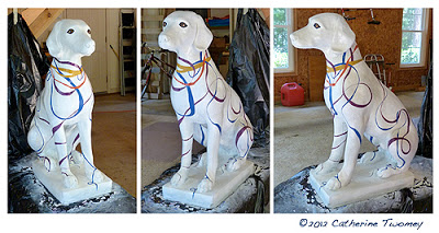
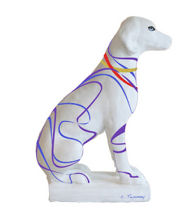
He's finished! Lookin' happy and good, your typical hound dog.

  • We have power!!! It's been out since Friday night, making for a very long, hot, basically incommunicado four days. Lots of time spent at Starbucks & Panera. We really got hit by the derecho (straight line) storm, and so did lots of people, trees, homes and power lines. There are still over one million people without electricity, and it's 95 today.
  • The best thing I could do with time on my hands was finish the SPCA hound dog for the "Dogs and Cats Around Town" event, so I did! There is Chance the Hound above. On Friday afternoon we're taking him to the Downtown Mall in Charlottesville, where there's going to be a big kick-off for all 18 dog and cat statues at 5:00 pm at the Freedom Wall. Everyone's invited so come on down!
  • Hope everyone else is well and staying cool. It's great to be back!

Marketing: Emerging Artist Tips

• Recently I was contacted by a young, fresh out of art school "artist" who specializes in illustration. I put "artist" in quotes because he's currently working at a Starbucks in New York City and trying to succeed on the side. A hard-working, very talented person who just can't seem to break into the field, and finding that the information given in art school just wasn't enough.
• Although it's been many years since I've had to start out attempting to become a successful artist, and though the tools have changed, the basic principles remain the same. I'm still marketing all these years later, so I'm going to occasionally post edited versions of the questions asked, along with my responses. 
Q: "My marketing strategy at this time is what I would consider bare-bones, but definitely not unknowledgable. As soon as I graduated from art school, I set to work gathering a long list of potential clients. I started at the magazine rack at Barnes and Nobles, and moved on from there to the internet. I find mastheads wherever I can, I grab the names and addresses for Art Directors, assistant ADs, Creative Directors, and so on, and I add them to the list. I do this whenever and wherever I can. Every three or four months, I then mail postcards with my work to everyone on this list. I feel strongly as if I need more diversity in my marketing strategy. I do not email because I can't be convinced that it's remotely effective or even worth the time that it would take to gather the few email addresses I could find (people seem to protect these better than their mailing addresses). I also believe that it's too easy to automatically get sorted into junk folders, whereas with a physical mailing, at the very least there's a good chance that someone will take a look at what I can do, at least for a few seconds. If I can grab their attention in that time, I win. If not, at least I had that shot."
A: Gathering contact information whenever and wherever you can is a great start, as is creating and mailing postcards. Your take on emails is correct; they're often lost, forgettable and viewed as somewhat lazy and intrusive.
• I have known people who've spent a large amount of money on creating show-stopping, die cut, expensive mailers. I'm not convinced that's a good investment. If you're already getting some calls from your mailings (and they're not mega printing dollars to do) then your talent speaks for itself. 
• From my experience, the same goes for purchasing (what are often hugely expensive) ads in the big advertising books like the Black Book. Before I would do anything like that, I would talk to some illustrator agents, art directors, other illustrators, etc. to try to judge whether the investment is worth it. I've spent thousands of dollars on ad books and sometimes gone for a long time with no results, although some claim consistency of your message (over the years) is critical.
• The world has changed a great deal, but you need to start doing cold calls. Mailings are not enough; they're too passive. You need to constantly get to the front of people's minds, and you can't do that if you don't talk to them and happen to connect with them the moment they have a need for your work.


Multiple samples of medical art
• Here's a sample of one of my early marketing pages which was published in a specialized medical art marketing book:

SPCA Auction Statue Progress

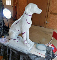
Starting the first layer of freehand painting in purple. Acrylic paint, Dick Blick Master Stroke Brush, & Q-tips

Starting work on a dog statue, now named "Chance" that will eventually be auctioned off at the "Dogs and Cats Around Town" Charlottesville Area SPCA.

Critical things needed to do this kind of work: a very steady hand and a very good brush.

It's a truism that this kind of work often looks much easier to do than it is. After wielding brushes for many years, I can tell you that practice is essential before you start the final work. Judge how easily the  brush becomes "loaded" or filled, with paint. Then, glide it across a practice surface similar to the final piece. I actually went outside and got some rocks, which really helped me understand what paint consistency was best, and how fine or thick a line I could easily make.

Spend some time stroking away and realize that no matter how much you practice, when you get to the real, final work you're bound to make some mistakes and you'll relax as you move along. Mistakes? Later I'll show you some custom-made mistake erasure paint. Not that I ever make mistakes. Ever.

On this particular statue, because I can't move it (150+ pounds?) I became a contortionist. I'm right-handed, which means my most controlled stroke is from left to right. Just imagine how I had to move around the statue - crouching, sitting, bending, leaning - to get the straightest, most beautiful thick and thin strokes. That was about 3.5 hours of painting and yoga!

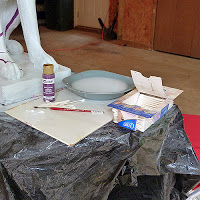
To get clean, thick and think strokes, I had no caffeine, lots of patience and a pretty expensive Dick Blick Masterstroke Kolinsky Sable #4 brush. The acrylic paint brand is "Folk Art" for projects like this, and was purchased at Michael's. The colors are all liquid and pre-mixed, so I knew exactly what I was going to get.

And the Q-Tips? One of the most essential tools in my magical box. I dip them in water and can easily wipe away errors in the finest details.

Chance will be standing in front of the Happy Cook this summer, so the colors I've chosen reflect some from Happy Cook place settings that were just beautiful. I started out with multiple layers of Krylon Primer followed by Satin White Paint, also by Krylon, also from Michael's.

One note: I plan to spray the entire dog statue with a semi-gloss clear acrylic sealant when it's finished. Until then, I'm careful not to rub up against the colored paints.

Back In The Saddle

Me & Kiwi the horse, of course
The Happy Ms. Kiwi & Me, Cover Girls

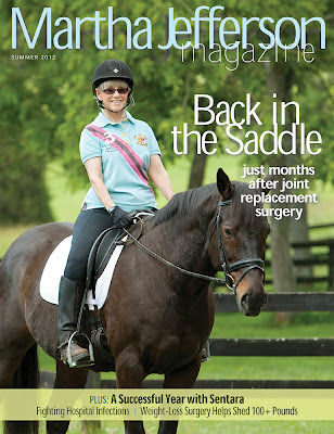
The hospital where I had my total knee replacement at the end of Feb. somehow decided I'd been the "ideal" patient. Clearly, they did not talk to my (Dear Husband) Rick or my PT Jana. So here are the results of a two hour photo shoot and 1/2 hour airbrushed makeup session. And the beautiful girl in the photo with the kind eyes and perked ears? Kiwi, now known as Kiwi-dashian. It IS great to be back

Note that I ride Ms. Kiwi in the sport of Dressage (United States Dressage Federation/USDF), which Steven Colbert has officially declared "The Sport of the Summer." I am not a rich or fancy person like Ann or Mitt Romney; I'm in the 99%* that love horses and riding, and put horses among the top of my priorities. I try my best to ride in correct biomechanical form, for the good of the horse.

*note the Virginia-clay colored Ariat boots, and though you can't see them, while cleaning them for this shoot, I found two holes in my chaps! Just went and got a new (washable - cool!) pair at Dover Saddlery

— with Bethany Wood in Earlysville.


A Horse of a Difference Color

Wickers the Warmblood getting towards the final painting.Labels showing what's going to be done next.

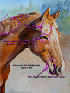
The portrait of Wickers is coming along. I'm starting to be satisfied with the masses that have been built up. On the right the labels show where I have concerns and more work to do.

I've grayed some of the areas away from Wicker's face, such as the mane area and lower shoulders and leg. I'm going to add more color into the face to draw more attention.
It's fun to look at the progress:
/catherinetwomeyart/2012/06/wickers-portrait-building-volume.html

Notice also that I've taken the liberty to reduce the size of Wicker's eyelashes. They really are long and beautiful, but cast in the sunlight they made her look like she was sleeping. Artistic license.

Dogs & Cats Around Town Auction

Working on the dog design for the Charlottesville Area SPCA Dogs and Cats Around Town auction in the fall. I kinda like this one.

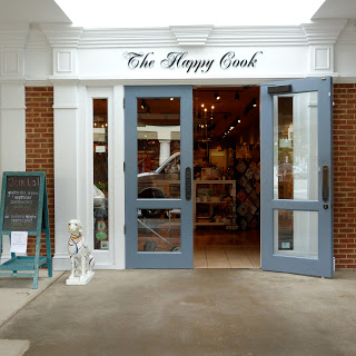
This pup is going to stand in front of The Happy Cook at Barracks road in Charolottesville, VA for three months before the auction. These are the colors found on some of their plates that I just loved. 


Input welcomed.

Learning By Comparing

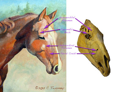
Two images, one of the oil painting and the other of the skull, comparing bony landmarks.

Ok, don't jump to conclusions, I am NOT finished with the Wickers portrait on the left! It is, however, slowly getting there, so I thought I'd take a break and show some anatomical landmarks from an actual equine skull, and where they are showing up on the oil painting.

The skull on the right is not Wicker's skull!! She is still alive and happily sleeping since at this moment, here in Virginia it's pretty warm & humid, so the horses are outside grazing overnight and sleeping in their stalls during the day. 

You can see that the skull (right) does not line up perfectly with Wicker's head. For example, Wicker's eye is lower down on her face, whereas her infraorbital foramen is higher. Of course, different ages, sizes and breeds of horses can all influence where features turn up. In addition, there can be anatomic anomalies (see "biology") that get thrown into the mix. 

When you're aiming for accuracy and believability, it helps to identify major bony landmarks to make sure you've included them and to also judge whether or not you are seeing and placing them correctly.

SPCA Charity Auction: Dog Name?


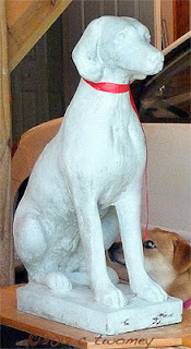
-  Up for a challenge? I am taking part in a fundraiser for the SPCA. They've asked me to use my artistry to paint this large cement hound to be auctioned off in the fall.

- Until then, after it's finished being painted it will stand in front of the Happy Cook on Rt. 29 in Charlottesville.

But I need a name!!! By tomorrow!! I was going to name her Lady or Queenie, but she's a boy!!! Being a Board Certified Medical Illustrator, I can recognize these things. Anyway, suggestions welcome, in the name of fun and animal charity!!!


- Oh, and I'm not painting the real, very nosy pup behind the statue; that's Moxey.

- Charity: CASPCA; Charlottesville Area Society for the Prevention of Cruelty to Animals

- Auction: "Dogs and Cats Around Town"

- CASPCA contactc: Cynthia Viejo

Wicker's Portrait: Building Volume

Another stage in the portrait process. This one has more hard edges.Oversmoothing on the Wicker's portrait. Color changed background.


Here's a link to the previous stages of the oil painting. The next steps are above.

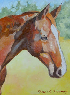
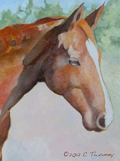
These are still relatively thin oil layers. I'm trying to work all over the canvas so I don't get too bogged down in one place. The image on the left is made up of mixed flat colors, whereas on the right they've been blended together. Too much.

Painting is a very strange process, especially if you're in The Zone. Right now I'm in The Zone, but I'm not at all happy with the portrait (right). I do, however, have enough experience to know that if I just keep going and don't panic, there will suddenly be a lightbulb moment and I'll know I'm on to something good.

So as I keep working away, often I step BACK away from the painting or leave the room for a break. The new perspective really helps to see what areas need more work. For example, I wasn't happy with how warm the lower background was (left), and how it was competing with the portrait. On the right you can see it's been cooled down with blues, whites, greens, etc. However, doing that has also made the face appear too cool and too flat. That too will be adjusted.

Every painter has their own approach and habits. One of mine that I constantly fight against is over-smoothing edges. I'm pretty sure that habit comes from years of using an airbrush!

I'm over smoothing/blending now in the right image. I'm about to start getting pretty thick with the consistency of the paint, so I know I can go back and adjust. Since the sunlight on Wicker's face is bright, I can leave some of the edges hard, keep the strong color and still keep the volume.

One final thing: I'm going to have to play around more with color and depth to get the right side of Wicker's face to really stand out from the background. Oh, and I hate the hard edges in the trees at the top. They're next on the agenda!