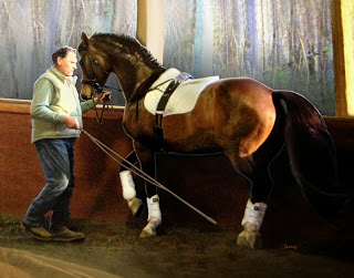
"In The Master's Hand" Oil on Canvas

In Hand Dressage With The Young Horse
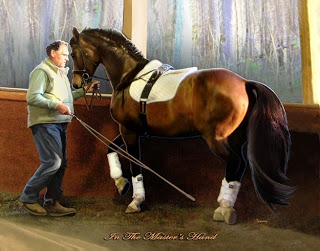
In The Master's Hand
Been working diligently on this commissioned piece, and starting to get it to the stage where I'm satisfied. The light has been a challenge but I'm starting to like the warmest color on the horse's hind end, as well as the tail highlights. I've also emphasized the little "flip" at the bottom of the tail that emphasizes the cadence of this dressage movement.

I love the attempts by this young warmblood gelding to piaffe by lifting his left hind as high as his right front foot. That, and the fact that the trainer patiently waits for the response to his aids. There is nothing quick and easy about dressage, but patience certainly helps and this image shows that.


Piaffe in Hand

Catherine Twomey Original Art
Piaffe in Hand
Since late August, my family has been in unexpected, unwanted yet very instructive crisis. My husband was diagnosed with kidney cancer while being checked for a minor intestinal upset. That led to surgery, which was unbelievably successful, and now a peaceful recovery.

In the meantime, I have been working on this commission of a master German dressage teacher in the initial stages of teaching a gorgeous warmblood to piaffe. I love the intimacy between the two as well as the light cast over the hard working pair. This work was a wonderful distraction during a very difficult time.

I am slowly coming to some conclusions and insights about what we just went thru, but that will make a later blog post. For now, I hope you enjoy this painting and the mysterious connection between humans and animals.
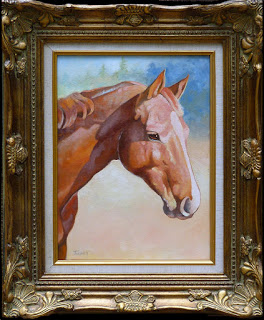
Wickers The Warmblood Finished & Framed

Framed, varnished and ready to deliver.light washes and color

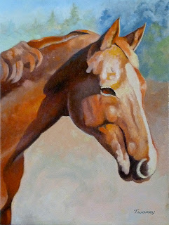
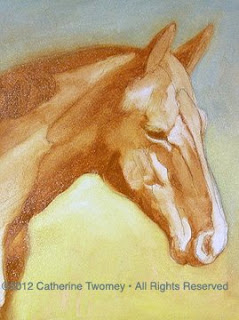
Finally finished up the portrait of the lovely Wickers the Warmblood. Wicker's owner is very pleased with how the portrait turned out, which makes it all worthwhile. I've included the very early wash-in phase of the painting on the right. The basic elements of light and dark followed through to the finish.

It would have been very easy to take the detail too far. I primarily wanted to capture her beautiful, soft eye in the sun.

A Horse of a Difference Color

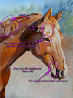
Wickers the Warmblood getting towards the final painting.Labels showing what's going to be done next.

The portrait of Wickers is coming along. I'm starting to be satisfied with the masses that have been built up. On the right the labels show where I have concerns and more work to do.

I've grayed some of the areas away from Wicker's face, such as the mane area and lower shoulders and leg. I'm going to add more color into the face to draw more attention.
It's fun to look at the progress:
/catherinetwomeyart/2012/06/wickers-portrait-building-volume.html

Notice also that I've taken the liberty to reduce the size of Wicker's eyelashes. They really are long and beautiful, but cast in the sunlight they made her look like she was sleeping. Artistic license.

Oil Portrait: Wickers Gets Some Depth

Oil portrait showing a dark wash of Wickers the Warmblood.
Now that the color background layer is started, the painting is starting to have some atmosphere. In this image, I have begun to add a deeper, sharper layer of Burnt Sienna with a touch of Ivory Black. The large value masses begin to give depth to the portrait, but they have a cookie-cutter effect due to their hard edges. These will be softened where needed. Note how the lighter & whiter areas of the face are beginning to "pop" - becoming more contrasty and prominent.
Compare this to the first wash to see the transition from thin paint to slightly thicker.

The Painter As Visual Leader

Step in the oil painting of Wickers the Warmblood with all colors established
Ok, finished with the 2nd background layer. I like the graduated tint from the cooler Cerulean Blue to the warmish Cad Yellow mixed with some Cerulean. I'm not ready yet to commit to anything definite in the background layer, but it will most certainly remain soft and without much detail. The focus will stay on Wickers.

Notice the areas where I went back and softened, such as along the neck top/mane, the ears, and down the shoulder. I used my fingers to blend the background layer into the horse and vice versa. These are areas I wanted to deemphasize, to bring the viewer back to Wicker's face.

My deciding to send the viewer to particular areas is a key difference between an oil painting and a photo. If I were outside in the pasture next door, talking to Wickers like I often do, I would be looking at her face and her entire body. However, being a human, in my focused field of vision I would have the most clarity looking right at one point on Wickers, such as her eyes and mid-face. Sure, I can see everything else, but not with the same level of clarity and detail. I could even paint the rest of her body without directly looking at it. It would, however, be softened value masses without detail, and probably somewhat distorted.

To test this, continue to stare at the screen you're reading now. Then, use your side/peripheral vision to see what's surrounding you. Don't turn your head or move your eyes! Now, imagine having to paint what you see peripherally, the way you see it.

If I were shooting a photo, however, unless I really knew what I was doing with apertures and exposures, most everything in the photo would have the same level of detail, lighting and focus. It's as if there is TOO much information at once. So when using photos as reference, use them with discretion. Think and plan what you're trying to accomplish in the end result so you don't slavishly mimic a camera's point of view. Make it your own!

I want to direct the viewer to what I think is the most interesting, intriguing place, then send them around the rest of the painting from there. When this is done successfully, it's much more like the real-time experience of being outside talking to Wickers & her big beautiful red self -with my eyes flowing from her eyes, face, neck, to her body, the grass, sun, sky, etc.


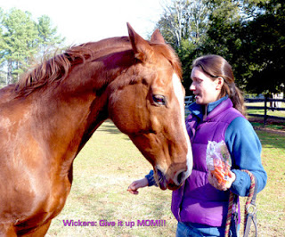
Photo of Wickers and Bethany at Wakefield: Twomey
Wickers and mom Bethany, With Carrots

Massing Values: Twomey's Wickers Portrait

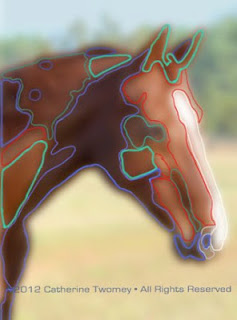
A softened image color-coded to a range of values.
It's at this point of getting ready to seriously build volume that I take a moment to analyze which direction to go. It's too overwhelming for me to just throw paint on the canvas - at least for this kind of piece. I need a plan.


To start, I would take the reference photo of Wickers and bring it into a photo editing program. I use Photoshop. Along the top menu bar is a category named "Filters." Select this, and from the drop down menu choose Gaussian Blur. Up will come a window containing the image, and a handy sliding bar that can be adjusted from barely blurry to very very.


Above is an example of how to mass values to help plan and start a painting. This method may work for you - or not. I'll share several. I'm showing what's really helped me over the last lots of decades! Take a look, for example, at the areas outlined in the light green on the softened image. There are four of them.


The values within these areas combined are all closely related. Their hue, depth, amount of dark and light are very similar.

To make use of this knowledge, I would mix a large amount of this particular color and put it down on the canvas in these areas. Then I would continue on with the next group of related masses. This technique can also be accomplished using a program like Photoshop, using levels or Artistic Filters.

I will eventually go back into the large masses and add subtle nuances of value shifts and details, and soften the cookie-cutter effect left by the application of massed values.

Eventually, the more you practice and understand values, the easier and more automatic it becomes.


Extra help here; a link to Adobe products. And no, I don't work for them let alone get any kickbacks for linking:


http://www.adobe.com/products/photoshopfamily.html?promoid=JOLIW