Here's a link to the previous stages of the oil painting. The next steps are above.
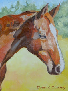
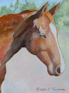
These are still relatively thin oil layers. I'm trying to work all over the canvas so I don't get too bogged down in one place. The image on the left is made up of mixed flat colors, whereas on the right they've been blended together. Too much.
Painting is a very strange process, especially if you're in The Zone. Right now I'm in The Zone, but I'm not at all happy with the portrait (right). I do, however, have enough experience to know that if I just keep going and don't panic, there will suddenly be a lightbulb moment and I'll know I'm on to something good.
So as I keep working away, often I step BACK away from the painting or leave the room for a break. The new perspective really helps to see what areas need more work. For example, I wasn't happy with how warm the lower background was (left), and how it was competing with the portrait. On the right you can see it's been cooled down with blues, whites, greens, etc. However, doing that has also made the face appear too cool and too flat. That too will be adjusted.
Every painter has their own approach and habits. One of mine that I constantly fight against is over-smoothing edges. I'm pretty sure that habit comes from years of using an airbrush!
I'm over smoothing/blending now in the right image. I'm about to start getting pretty thick with the consistency of the paint, so I know I can go back and adjust. Since the sunlight on Wicker's face is bright, I can leave some of the edges hard, keep the strong color and still keep the volume.
One final thing: I'm going to have to play around more with color and depth to get the right side of Wicker's face to really stand out from the background. Oh, and I hate the hard edges in the trees at the top. They're next on the agenda!

