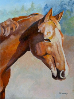
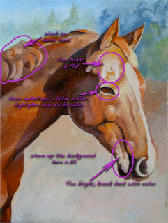
The portrait of Wickers is coming along. I'm starting to be satisfied with the masses that have been built up. On the right the labels show where I have concerns and more work to do.
I've grayed some of the areas away from Wicker's face, such as the mane area and lower shoulders and leg. I'm going to add more color into the face to draw more attention.
It's fun to look at the progress:
/catherinetwomeyart/2012/06/wickers-portrait-building-volume.html
Notice also that I've taken the liberty to reduce the size of Wicker's eyelashes. They really are long and beautiful, but cast in the sunlight they made her look like she was sleeping. Artistic license.

