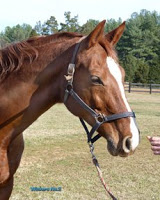
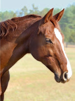
To the far left is the final reference photo for Wicker's portrait. It's been edited using Photoshop filers (and levels) for greater warmth. It also helps clarify my vision for the final painting.
Compare the left photo with the one on the right, which was the original reference photo. Try to isolate the decisions I've made as an artist about what to include and what not.
I've zoomed in a little closer for a more intimate portrait. Per discussions with Wicker's mom, I've removed the halter by combining photos - one with a halter, one without. In Photoshop, I've softened the background and created distance so the focus is on Wickers. I've retained the greatest detail around her eye and the slope of her face. I pulled out depth in the shadows and balanced all the colors.
Oh, and I removed the hand and mini-carrot, commonly used for equine photographic bribery.

